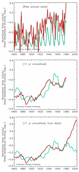
"The illustrations [below] show the raw data for temperature and solar activity at the top, then that data with a 11 year running average to filter out the normal solar activity period. The middle graph suggests a correlation between solar activity and temperature, even though the peaks are offset. But when the last few years of data are included, the curves diverge and severely weaken the case for the driving of temperature by this measure of solar activity. These illustrations were prepared by Chris Merchant, School of GeoSciences, University of Edinburgh from the original data."